6 Things You Shouldn’t Do With Printed Newsletters
 Design and content are keys to your printed newsletter’s success. Readers, including your current and past clients, referral partners, etc., will quickly judge your newsletter and whether or not they will read it. It is also a reflection of you and the image of your law practice. It can validate your competence as a law firm and can help differentiate you.
A branded, informative, attractive, and easy to read printed newsletter gets read while cluttered and amateurish newsletters don’t. Consumers have shorter attention spans and more distractions. You need to quickly capture their attention and interest with a good design and provide helpful and informative information.
Here are six things that we recommend not doing, when designing your law firm’s printed newsletter:
1. Use restraint when using bold type
Creating entire paragraphs with text set in bold type are hard to read. The purpose of bold type is to emphasize key content and to briefly slow the reader, so they pay attention to what you want them to see. It is meant to focus and slow down the reader, but if you if you slow them down too much, they may not read it at all.
2. Do not over use underline
Underlining is important for headlines and for emphasis of important ideas; however, using excessive underlining makes words harder to read and can greatly reduce its impact. Underlining also makes it harder for readers to read descending letters like g or p. Underlining can often confuse meaning as readers today often assume underlining is a hyperlink.
3. Don’t be afraid of white space
White space often affects how your designed newsletter is perceived. Without proper white space, important information may get lost. White space is the absence of text, images, graphics, etc. A newsletter article or page that is crammed with text with little or no white space appears overwhelming, busy and cluttered. In addition to being hard to read, it often turns-off the reader, who already has a short attention span. For today’s reader, less is more. Place longer articles on your blog or website.
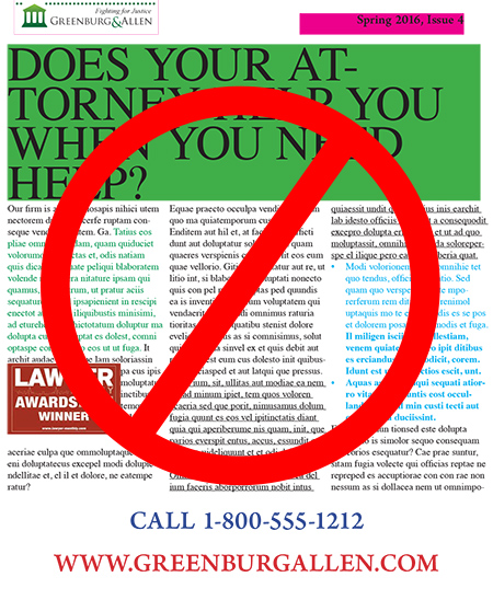
4. Do not overuse upper case type
WHILE USING CAPITAL LETTERS MAY SEEM LIKE A SIMPLE WAY TO MAKE YOUR TEXT STAND OUT, IT SIGNIFICANTLY MAKES IT HARDER TO READ THAN WORDS SET IN A COMBINATION OF UPPER AND LOWER CASE TYPE. OVERUSE OF CAPITIALIZATION IS DISTRACTING AND ANNOYING TO THE READER.
5. Avoid using long sub-headlines, which takes too long to get to the point and loses readers
Short sub-headlines are more effective than long sub-headlines which slow the reader down. The goal of a secondary headline is to elaborate the main headline. The best subheads often use simply keywords introducing the next topic. It allows the readers to quickly glance at and understand what the article is about.
6. Misuse of color
Color, whether as text, background, or accents, is best when used with restraint. Color can interfere with readability and can reduce the message. Color should also reflect your law firm’s brand without overdoing it.
Professionally Designed Newsletters? Get Started Today.